How to Choose the Right Bold Colours for Your Wall Cladding
Table Of Contents
Experimenting with Sample Boards
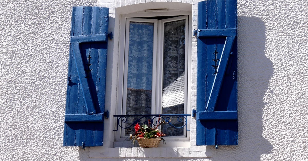
When selecting bold colours for wall cladding, it’s essential to create sample boards that showcase various shades side by side. This practice allows homeowners to visualise how the colours interact with each other and with the surrounding environment. Different lighting conditions can significantly alter the appearance of colour, making it vital to test the samples at various times of the day. The closer the samples resemble the future wall in terms of lighting and context, the better the final decision will be.
Using physical boards rather than digital representations holds significant advantages. Hands-on experimentation provides a tangible sense of how a colour feels in the space, as well as how it complements existing elements like furniture and flooring. Adding texture to the sample boards can enhance the experience, giving a more comprehensive perspective on how colour and material work together. Observing these combinations can lead to discoveries that may not have been apparent during initial colour selection stages.
How to Test Colours Before Committing
Prior to making a decision on wall cladding colours, experimenting with sample boards can offer valuable insight. Selecting a range of shades that appeal to your preferences is essential. Apply these samples to the actual walls, observing how the colours change with varying light throughout the day. This practice ensures that the final choice harmonises with the space, rather than just looking appealing in isolation.
It's also wise to consider the surrounding elements in your decor. Furniture, flooring, and fixtures can affect how colours appear within a room. By placing items that will exist in the space next to the samples, you gain a clearer perspective on how the colours will interact with one another. This thorough approach helps you avoid any post-application regrets and leads to a more cohesive overall aesthetic.
The Importance of Texture
Texture plays a crucial role in how colour is perceived within a space. Various textures can either enhance or dull the vibrancy of a bold colour. For instance, a shiny, smooth surface can reflect light and make colours appear more vibrant, while a rough, matte finish may absorb light, leading to a more subdued appearance. Understanding the relationship between texture and colour can help in creating a more dynamic and visually appealing wall cladding.
Beyond mere appearance, texture contributes to the overall feel and atmosphere of a room. It can evoke different moods and sensations, influencing how one engages with the space. Incorporating textured elements in conjunction with bold colours allows for a layered depth, creating interest and inviting touch. Choosing the right combination can transform a standard wall into a striking feature that adds personality and warmth to any setting.
How Texture Influences Colour Perception
Texture plays a crucial role in how colours are perceived in any space. A smooth surface may enhance the brightness of a bold hue, allowing it to reflect light in stimulating ways. Conversely, rough textures can absorb light, muting the vibrancy of colours and creating a sense of depth. This interaction can significantly alter the visual impact of your chosen palette, making the decision about surface treatment just as important as the colour itself.
The materials used in wall cladding further influence how we experience colour. A natural timber finish may evoke warmth and richness, enhancing earthy tones, while shiny metal surfaces could amplify the energy of brighter colours. Understanding how different textures respond to lighting and colour can guide homeowners in creating a harmonious look. Experimenting with various combinations in your chosen environment can yield surprising results that are both aesthetically pleasing and can even alter the mood of a space.
Seasonal Considerations
When selecting bold colours for wall cladding, it's essential to consider how seasonal changes can affect the appearance of those colours. Bright, vibrant shades may look striking in the summer sunlight but could appear different during the muted light of winter. The way light interacts with your chosen colours often transforms their vibrancy throughout the year, making it crucial to assess how these hues will reflect the changing environment around your home.
The impact of the seasons extends beyond just light conditions. The Australian climate can shift significantly, from the dry heat of summer to wet, heavy rains in winter. Such variances can influence how colours age over time. Opting for colours that maintain their appeal across various conditions can create a visual harmony that lasts. Taking these seasonal factors into account can ultimately guide you in selecting colours that look vibrant year-round, ensuring a cohesive aesthetic for your home.
Choosing Colours for YearRound Appeal
Selecting colours that can stand the test of changing seasons increases the longevity of your design choices. Emphasising hues that harmonise with natural elements creates a strong visual impact regardless of the time of year. Earthy tones, for example, evoke a sense of groundedness in summer while maintaining warmth during winter. Bright colours might energise a space in the warmer months, but they can also offer a refreshing contrast to the muted shades of colder seasons.
Another consideration is the effect of light throughout the year. Different lighting conditions influenced by seasonal changes can dramatically alter how colours appear on your walls. A hue that looks vibrant in direct sunlight may seem dull during overcast days. Observing how your chosen colours interact with your surroundings at various times can ensure a cohesive aesthetic that remains appealing all year round.
FAQS
What should I consider when experimenting with sample boards for wall cladding colours?
When experimenting with sample boards, consider the size of the boards, the lighting in your space, and how the colours interact with other elements in the room. It's also helpful to observe the samples at different times of day to see how the natural light affects the colour.
How can I test colours before committing to a bold choice?
To test colours before making a final decision, you can purchase sample pots of paint and apply them directly to your wall. Alternatively, some companies offer peel-and-stick samples that can be easily removed. Observing the colours in various lighting conditions will also help you gauge their true appearance.
Why is texture important when choosing colours for wall cladding?
Texture plays a vital role in how colours are perceived; it can enhance or diminish the vibrancy of a colour. A textured surface may reflect light differently, altering the appearance of the colour, so it’s essential to consider both elements together.
How does texture influence colour perception?
Textured surfaces can create visual interest by adding depth to colours, often making them appear richer or more muted depending on the texture's nature. For example, a rough texture can absorb more light, leading to a darker appearance, while a smooth finish can reflect light, making the colour seem brighter.
What seasonal considerations should I keep in mind when choosing wall cladding colours?
Seasonal considerations include how the colours will look throughout the year with changing natural light and surrounding foliage. Choosing colours that harmonise with seasonal changes can create a cohesive look, ensuring your space feels inviting and fresh all year round.
Related Links
The Role of Colour Psychology in Wall Cladding SelectionThe Impact of Bold Colour Palettes on Interior Spaces
Inspiring Examples of Bold Colour Applications in Wall Cladding
Mixing and Matching Bold Colours in Wall Cladding Designs
Popular Bold Colour Trends in Contemporary Wall Cladding
Creating a Statement with Colourful Wall Cladding Solutions
Combining Textures and Bold Colours in Wall Cladding
Transforming Exteriors with Striking Wall Cladding Colours